We had one task from a client – make a more modern website design. We wanted to go beyond and look for ways to improve the user experience to increase conversion rates.
Here's the result:
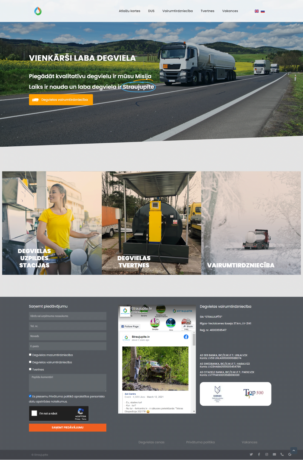
Before
After
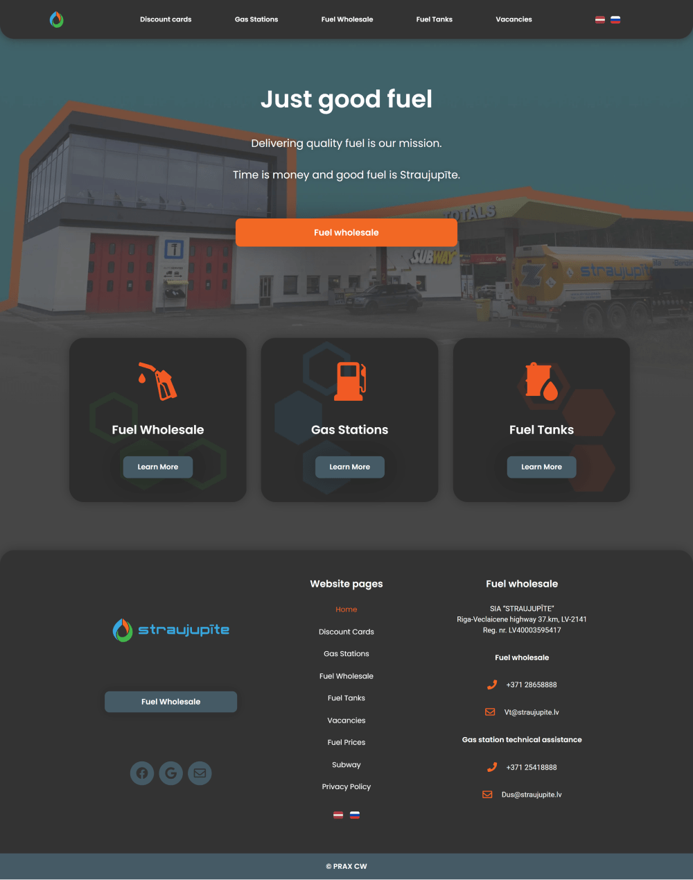
Before
After
Result-oriented outcome
Our redesign with improved user experience increased the conversion rate by ~20%
Redesign process
Redefining color palette
We changed the base color from white to gray to highlight the bright logo colors and give a balanced feeling, as gray is solid and stable, creating a sense of calm and composure, relief from a chaotic world.
This change helped to connect deeper with their ideal client – companies who look for the best quality/price ratio fuel wholesaler. Our client’s main value proposition is a compromise – good fuel for a good price.
Getting rid of stock photos
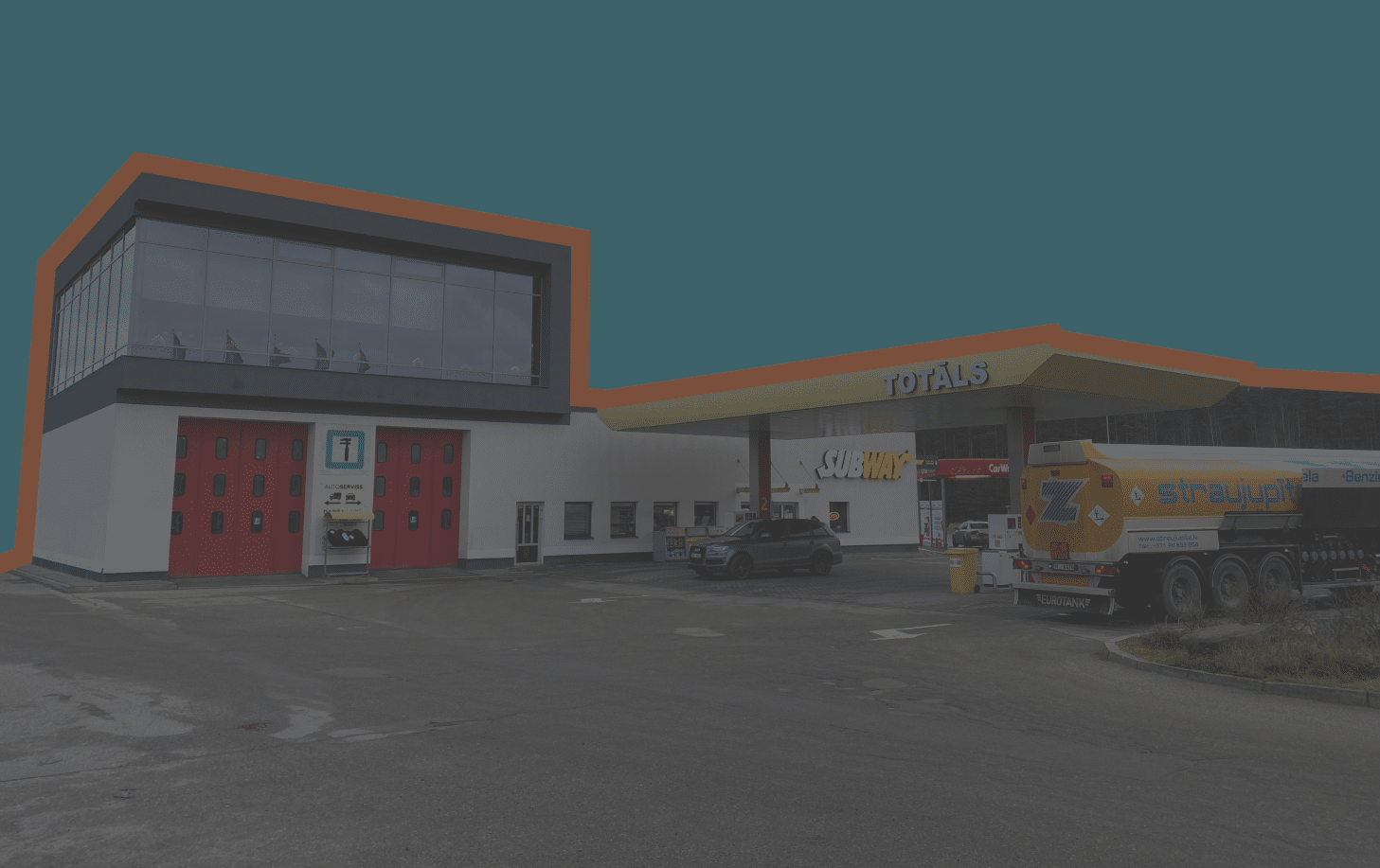
One of the challenges was the lack of quality pictures of the client’s business.
Using stock photos is unprofessional and unnatural. Therefore we improvised and heavily edited the available photos.
To compensate for the lack of quality photos, we also used different icons. A combination of grey background and orange accent color played in a beautiful & simple design language.
Designing goal-oriented interface
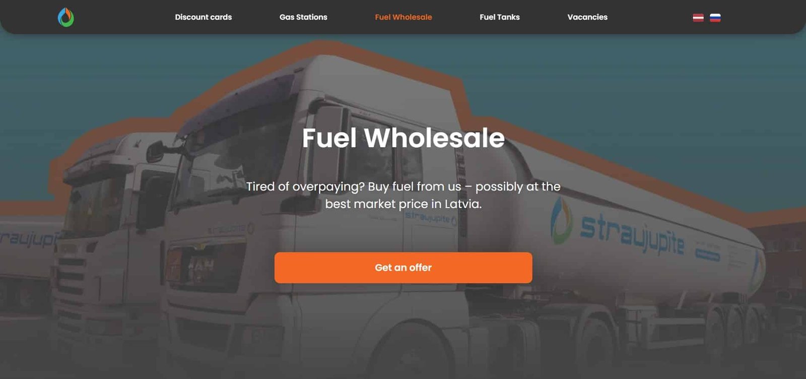
While designing, we made sure that website visitors can easily submit their order requests. It means that call to action button is easily accessible on any site.
On top of the page, in the middle, at the bottom – easily accessible and eye-catching button to make visitor’s decision easier.
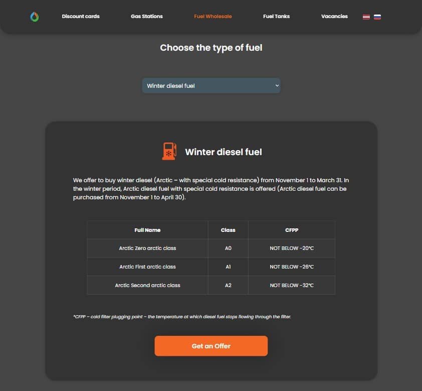
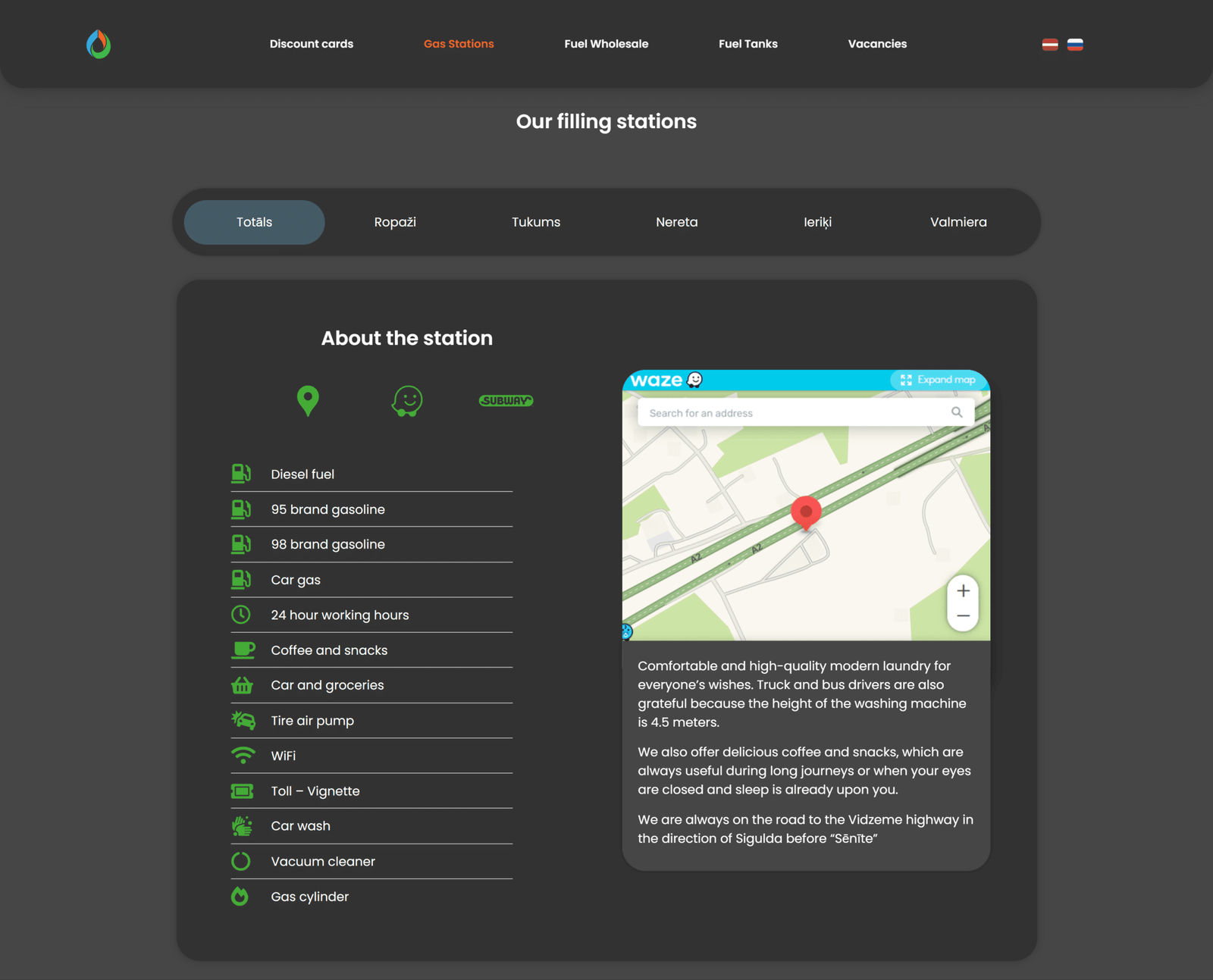
Improving readability
There was a lot of information to display. The challenge was to design it so it retains readability and easy access.
Endless scrolling to find relevant information deters user engagement. For example, we used tabs to display six blocks of information about filling stations.